Metrolink fare restructure
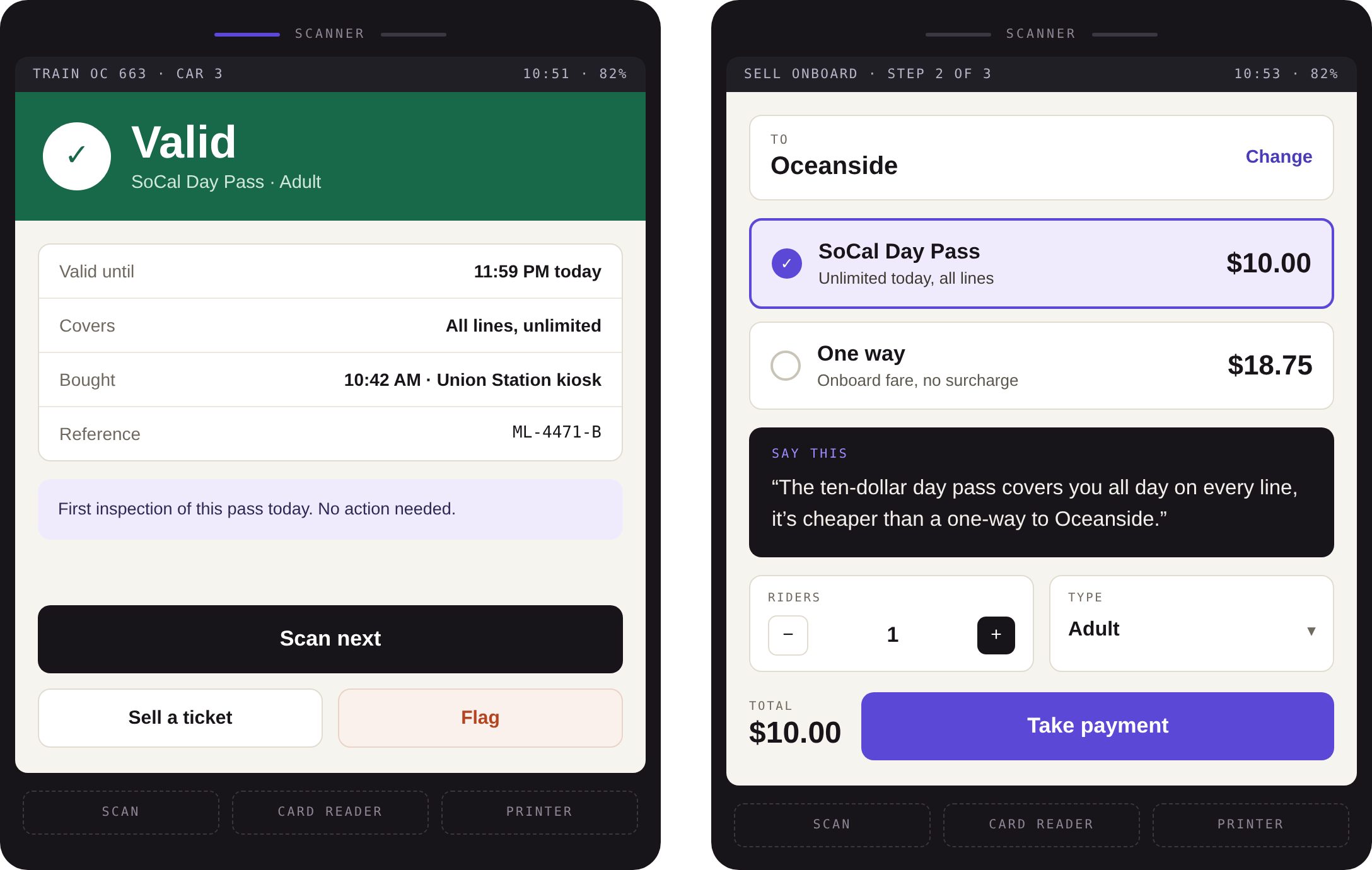
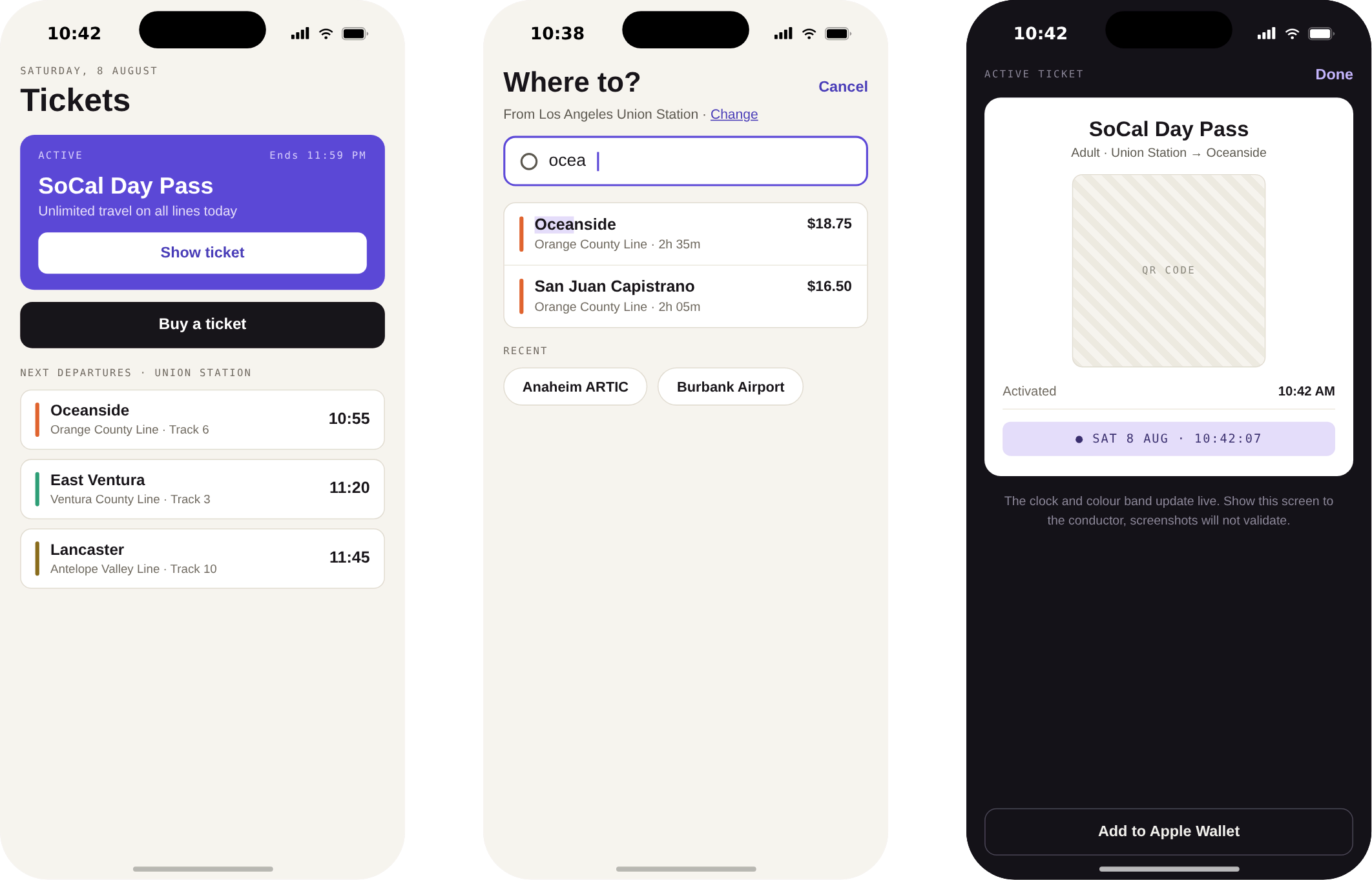
Metrolink replaced a distance-based fare table with a simpler structure, and every surface that sells a ticket had to change with it: ticket vending machines, the machines conductors carry, and the app.
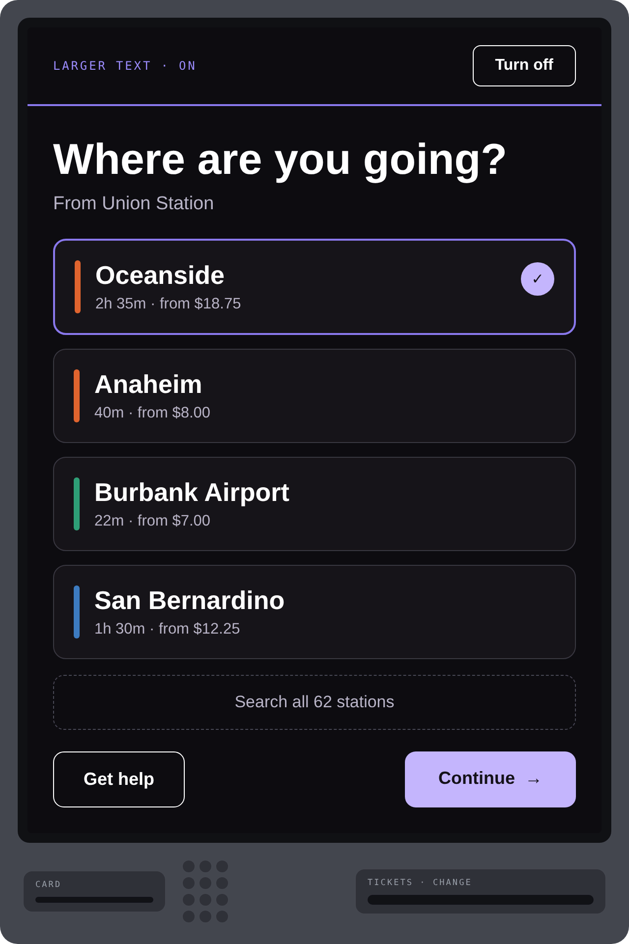
A vending machine is an unforgiving canvas. Outdoors, glare, gloves, a queue behind you, a train in four minutes, and a touch target that has to survive a resistive screen from 2011.
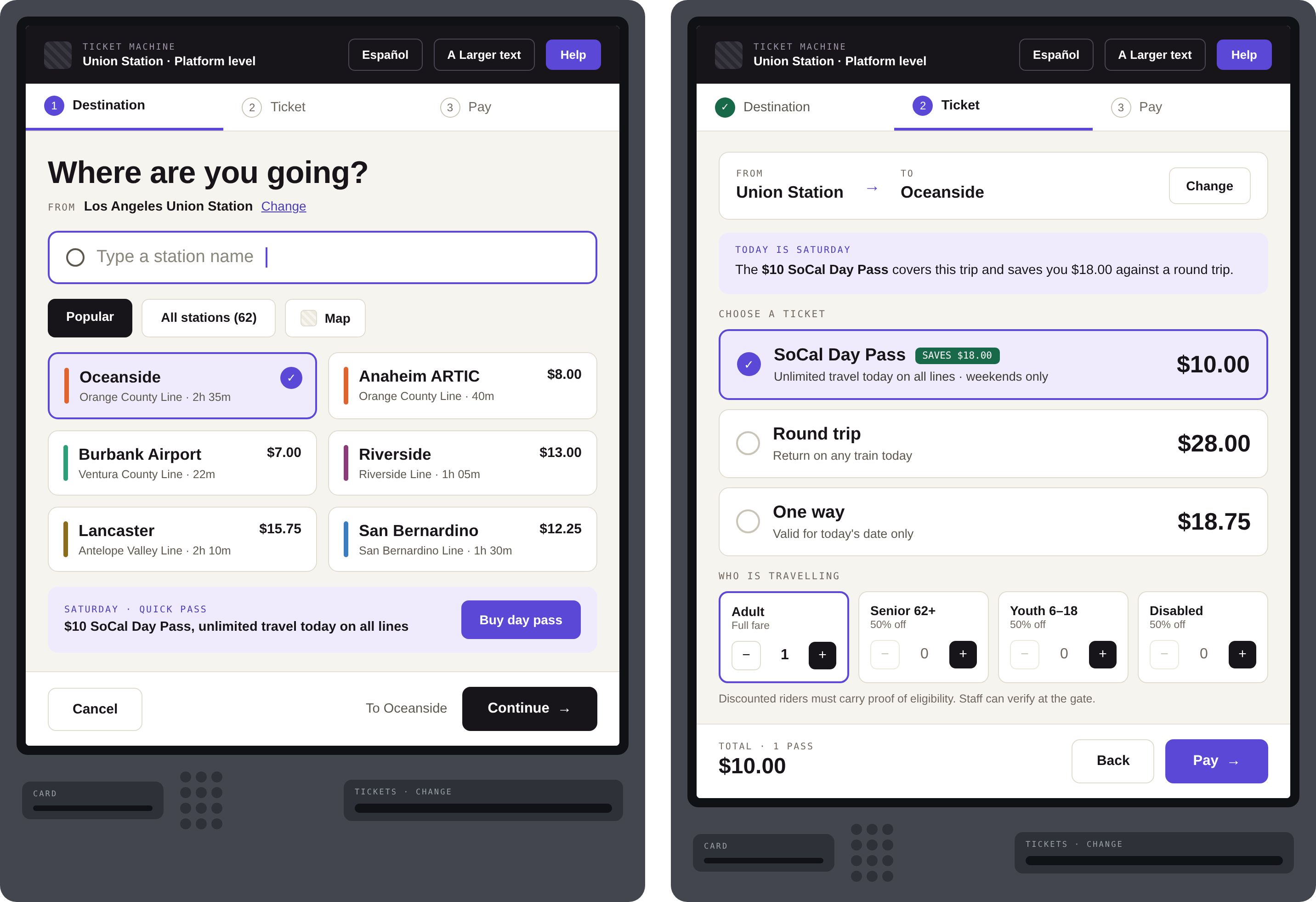
Three decisions, no more
The old flow asked a long list of questions. We got it to three by moving the rest into defaults that are correct for the common case and visible enough to override: today’s date, one adult, return not selected.
The running total sits in the same place on every step. In testing, the single biggest cause of abandonment was not confusion about the fare, it was not knowing how much had accumulated before the payment screen.
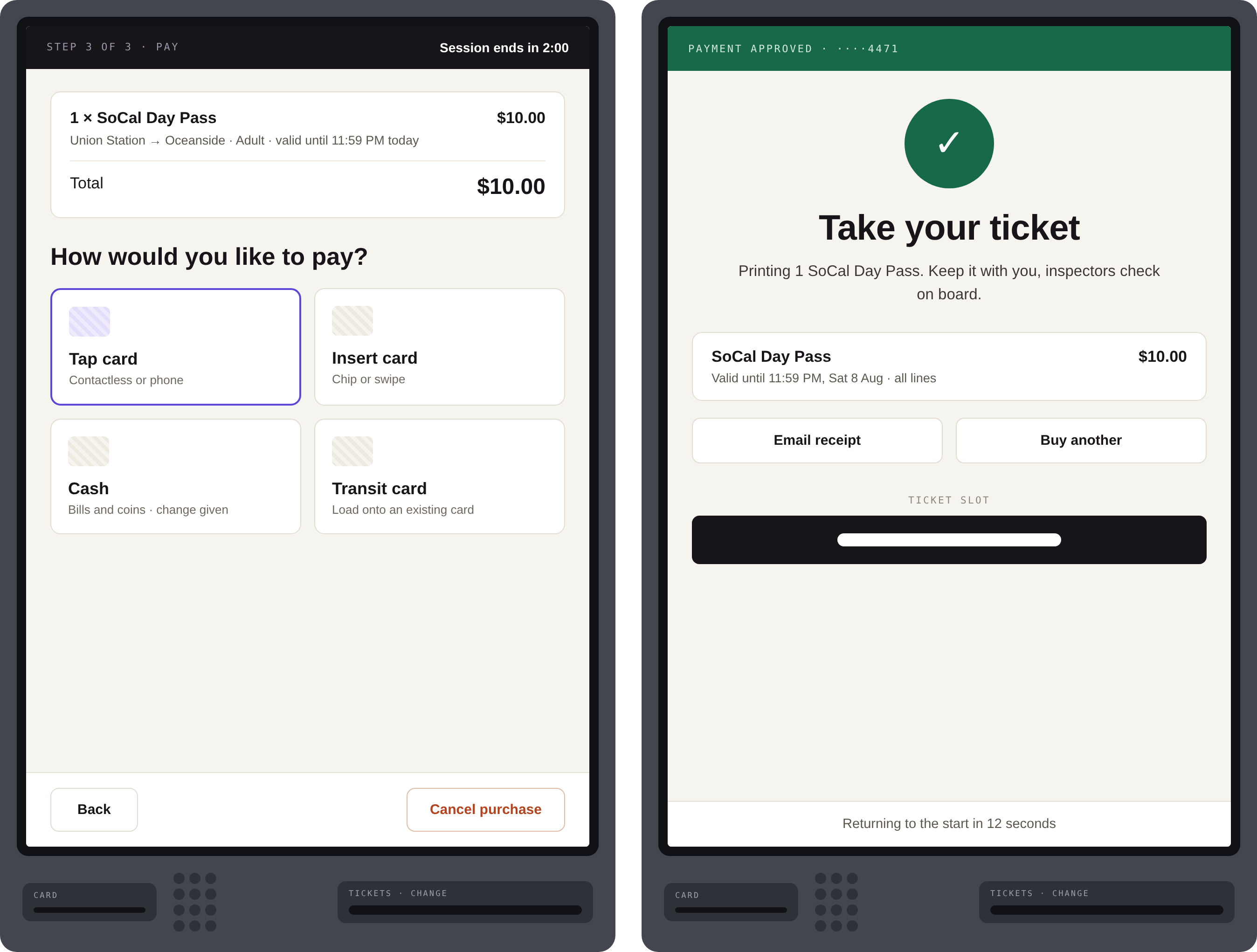
Three surfaces, one model
The same fare model shipped to three places at once: the vending machine, the handheld the conductor carries, and the app. The conductor device turned out to be the honest reviewer of the whole restructure, if a conductor cannot explain a fare in one sentence on a moving train, the fare is wrong, and no interface will save it.
The app mirrors the machine’s order exactly, same three decisions, same sequence, so a rider’s second purchase is muscle memory regardless of where the first one happened.