Health
Health is Lyft’s internal analytics tool for marketplace health, the live balance of rider demand and driver supply in every market. Leadership and revenue operations use it to decide where to price, spend and intervene. The brief: design the data-analytics dashboard that lets them monitor that balance and act on it.
Six months, high priority, sole designer, embedded with a staff engineer and a senior engineer on the Decision Apps & Metrics Explorations team, inside Central Market Management & AI.
The problem
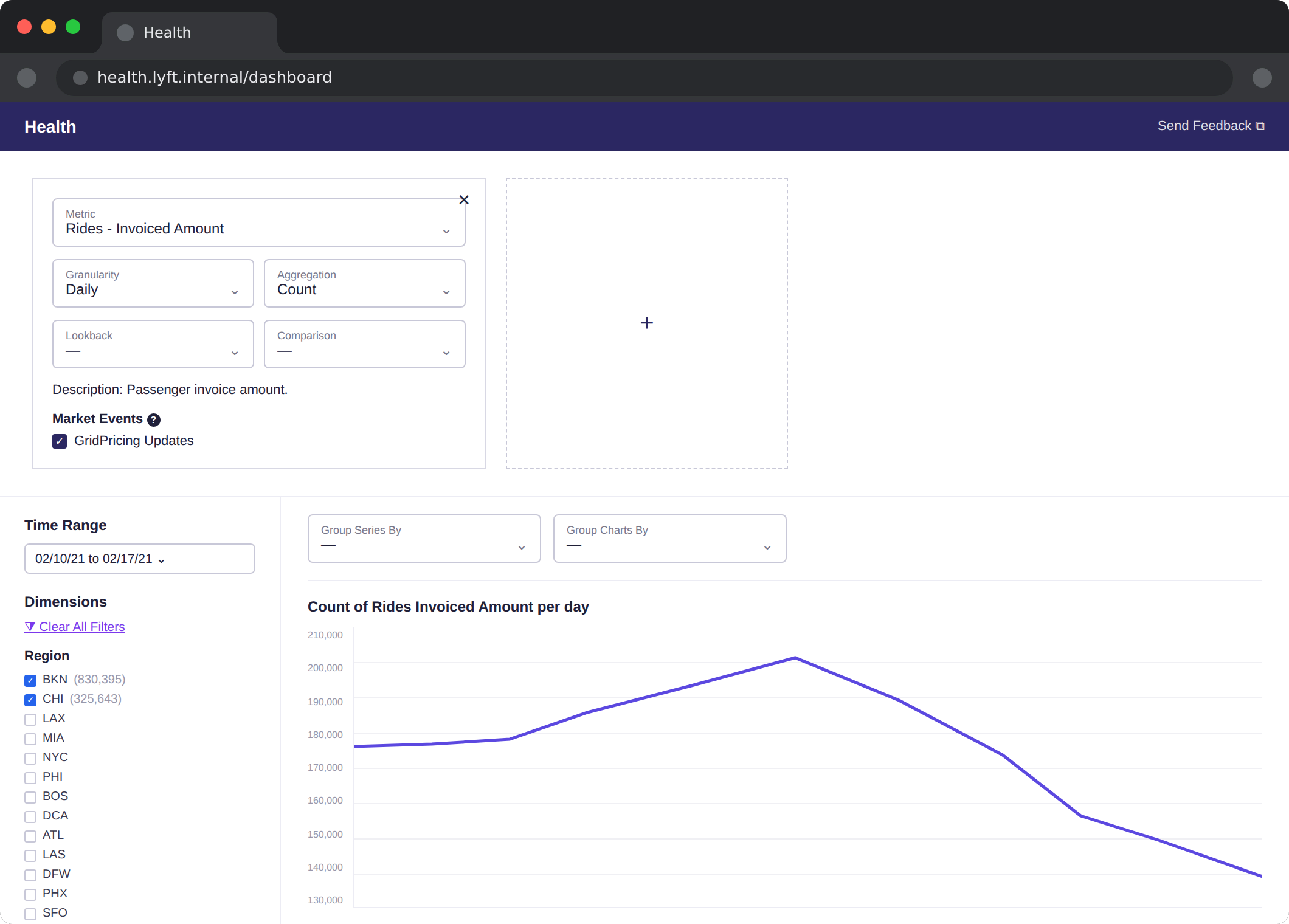
The existing dashboard offered limited filtering, inconsistent metrics, no visual hierarchy in its dimensions, and leaned heavily on one chart and one metric at a time. Around it, the tooling was fragmented, Command Center for operations, Mode for queries, ad-hoc SQL for everything else, so a question that should take a minute took a meeting.
The charge was to turn this into a seamless, intuitive experience that balanced three things that usually fight each other: power, flexibility and clarity.
Listening to the users
I interviewed the people who live in this tool, pricing leads, analysts, supply managers, about their goals, what worked and what did not, how they build their reports, and the tools and process around them. Their asks, in priority order: faster filtering, multi-metric views, categorised metrics, layout customisation, shareable reports, data export, and anomaly detection tied to market events.
Two distinct user bases emerged. Leadership wants a quick pulse, trends, summaries, quarterly targets. Analysts and data scientists want power, queries, saved views, exports, and above all trust in the metrics. The rule that resolved the tension: summary first, depth one level down, and never make the analyst pay for the executive’s simplicity.
I also studied Grafana, Mode and Power BI closely, Grafana’s technical depth, Mode’s simplicity, Power BI’s interactivity, specifically their metric UI, settings and filters, legend interactivity and chart behaviour, looking for the patterns worth stealing and the complexity worth refusing.
Views, not screenshots
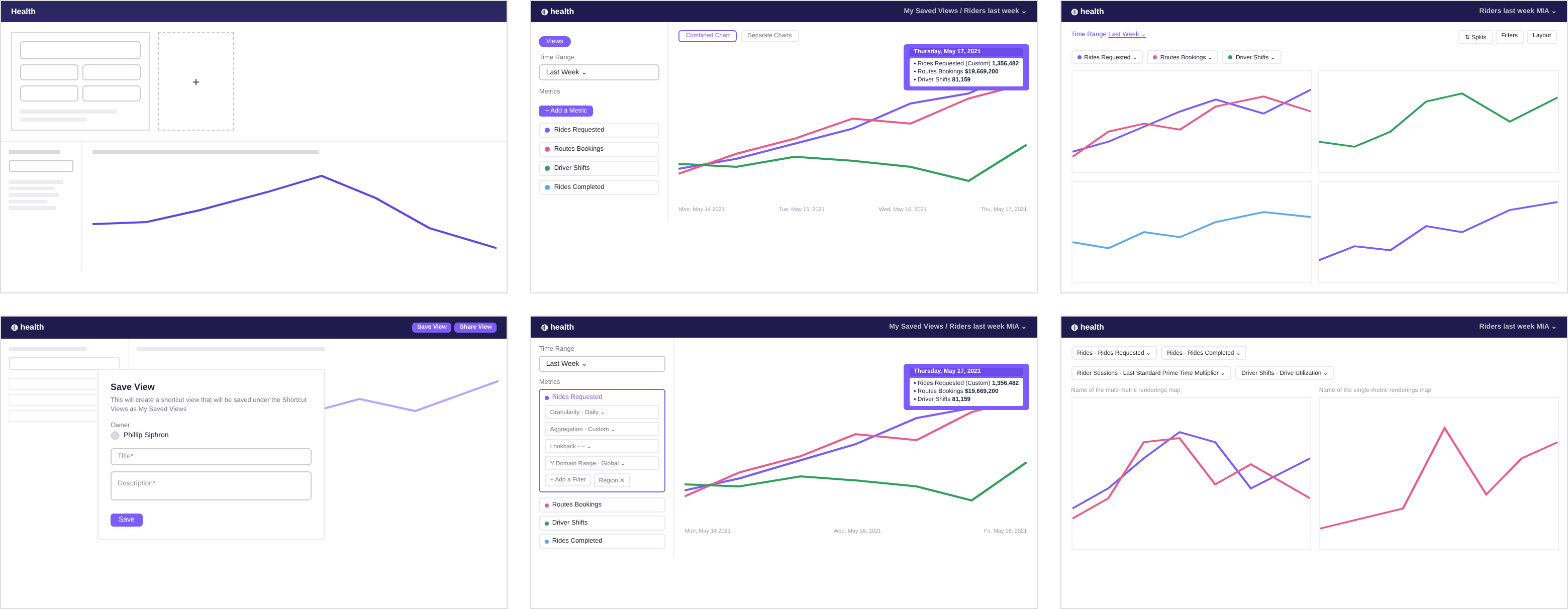
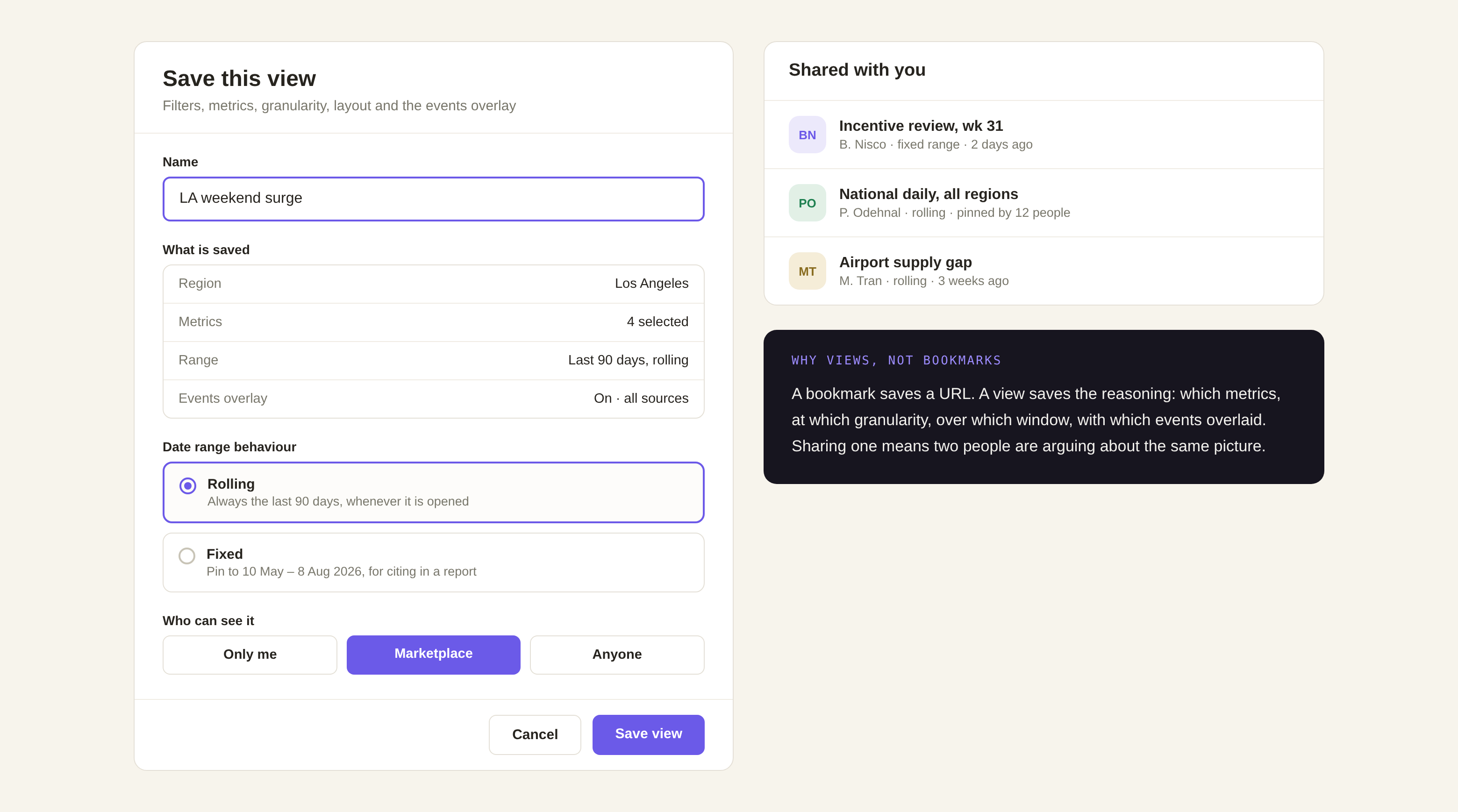
The structural move was “views”, a dashboard header that lets anyone save their current setup, pick up where they left off, and share a view with someone else instead of screenshotting it. An edited view warns you, and offers reset or save. Reports stopped being artefacts people rebuilt every Monday and became addresses people return to.
Charts people can trust
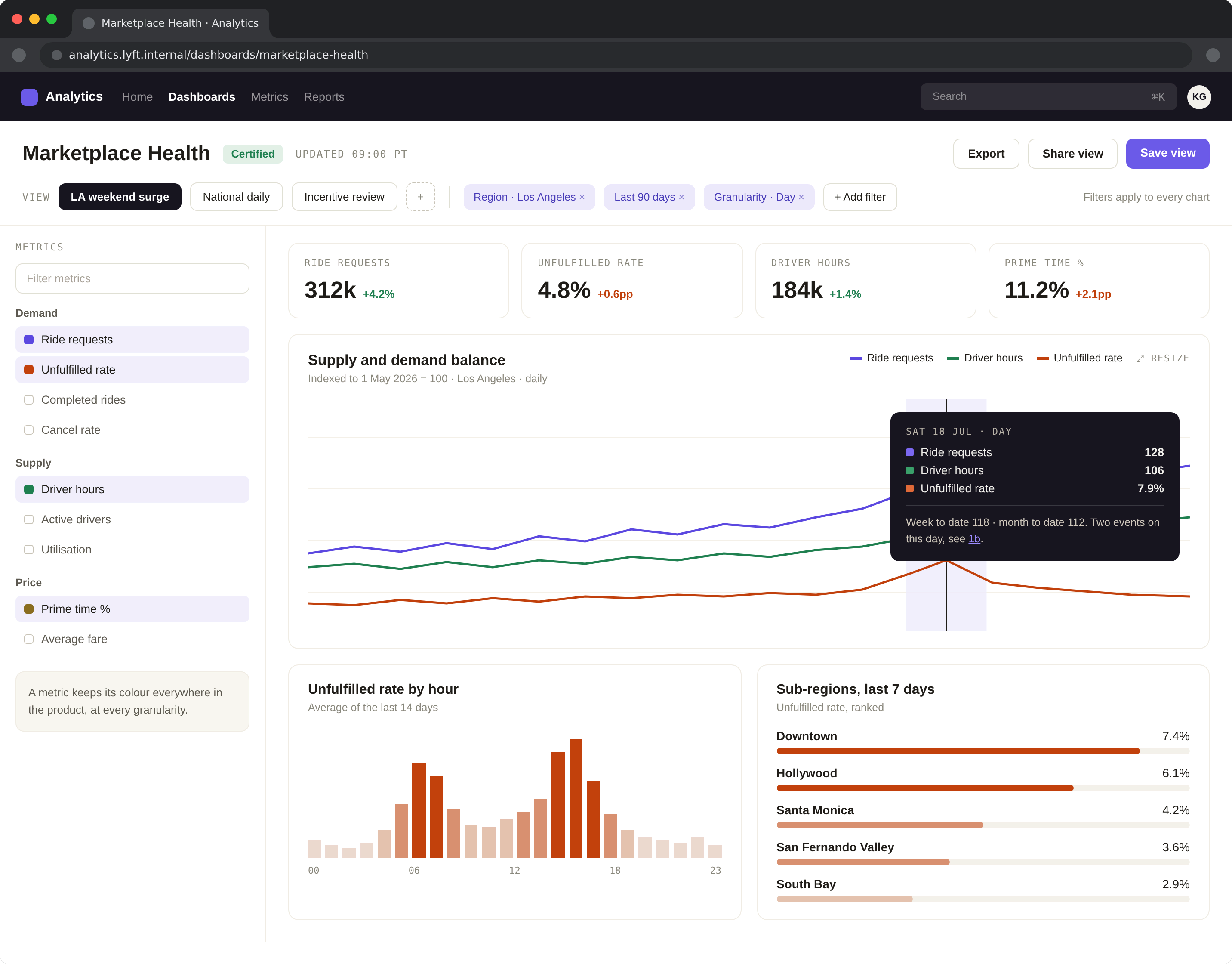
Multi-metric charts got stable line colour schemes that hold steady across groupings and lookback windows, so the same metric is the same colour on Tuesday as it was on Friday. Tooltips were refined to differentiate timestamps in cross-granularity settings; global and region-specific filters narrow the world to the business area in question; and the chart grid became customisable, drag-and-drop resizing, with a reorganised metric selection that puts advanced configuration within reach instead of in the way.
Market events and anomaly detection
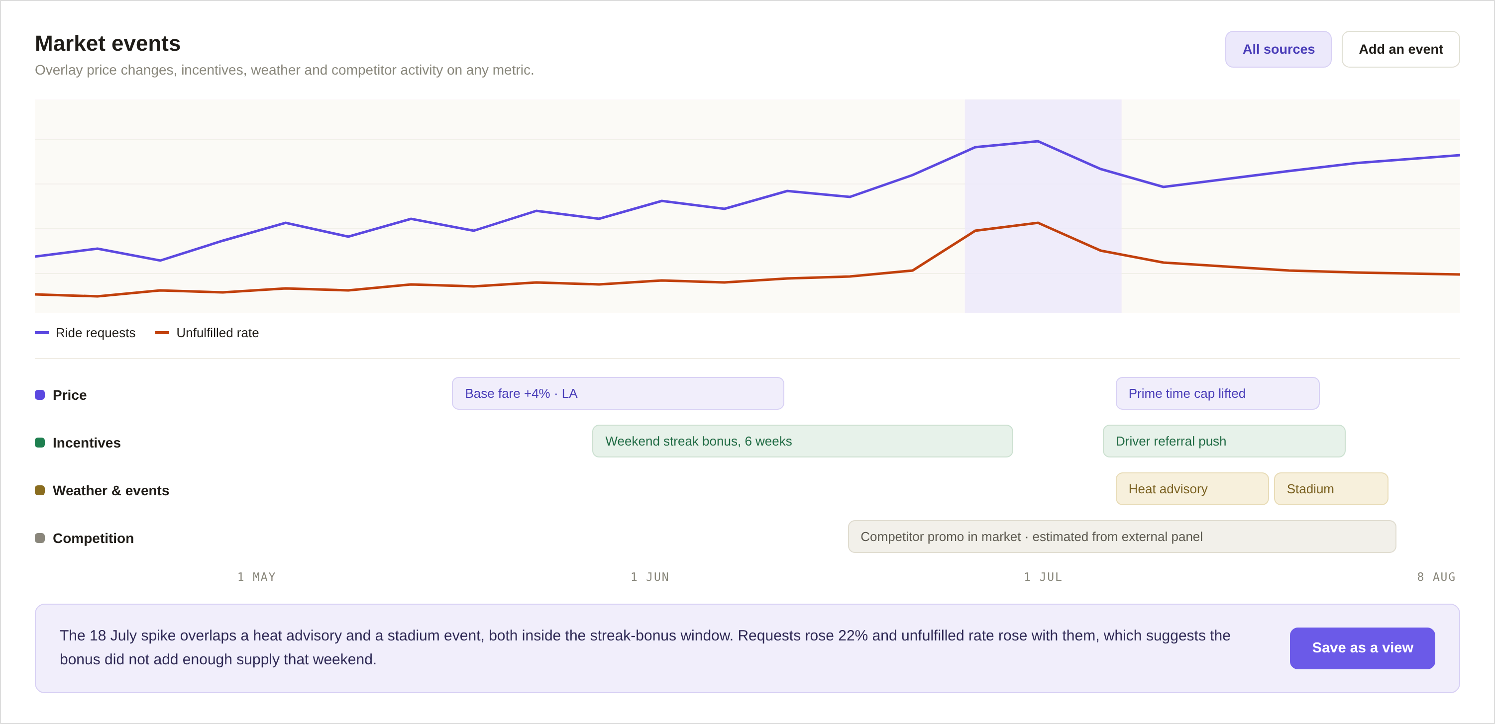
Metrics move for reasons, and the reasons were invisible. I designed Market Events so revenue operations can see every factor acting on a market, price changes, incentives, severe weather, competition, on an interactive Gantt view alongside the key metrics. A spike stops being a mystery: you can spot the trend, confirm which action caused it, and plan for what is coming.
From one dashboard to an ecosystem
Health worked, and that exposed the bigger problem: eight tools scattered across the company, Executive Dashboard, Regional Insights, Price Commander, Market Management, Reports, Source of Truth, Mode, Health. Executive Dashboard users did not know Health existed. There were two search boxes and neither could find a metric without its exact name. Products were siloed with no way to move between them, and new users got no onboarding at all.
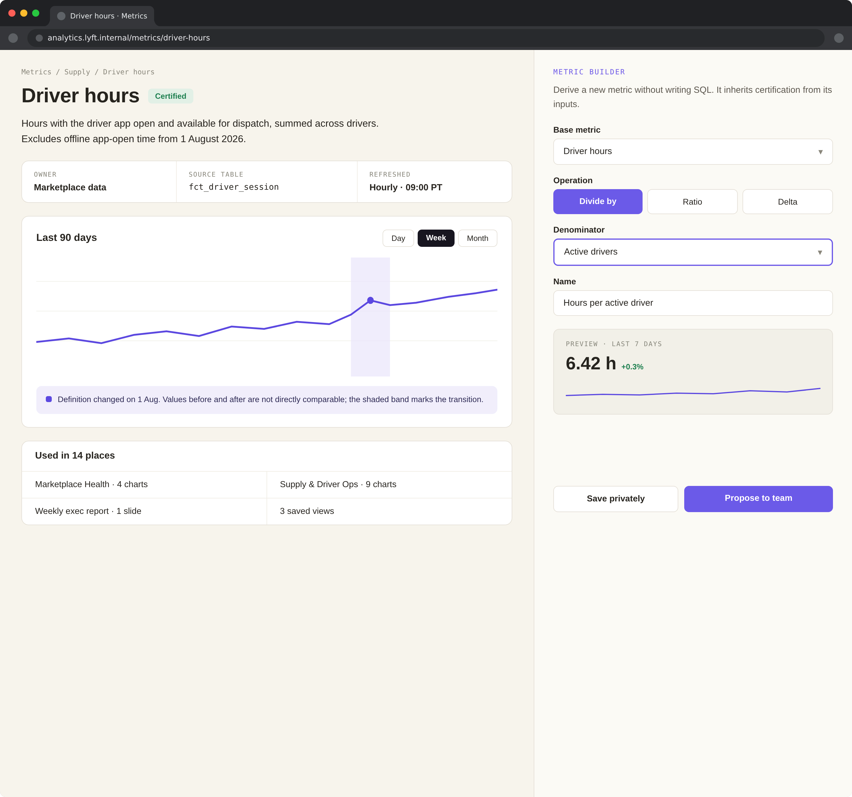
I started with usage data (most-visited dashboards, visits by tab, engagement by persona) to see what people actually use day to day, which dashboards are core, and where users drop off. Then the information architecture: audit for duplication and findability, group products by intent, Monitor, Explore (Health, renamed), Regional Insights, Source of Truth, consolidate pages into clear buckets (Marketplace, Rider, Driver, Levers), and hold the whole thing together with consistent naming.
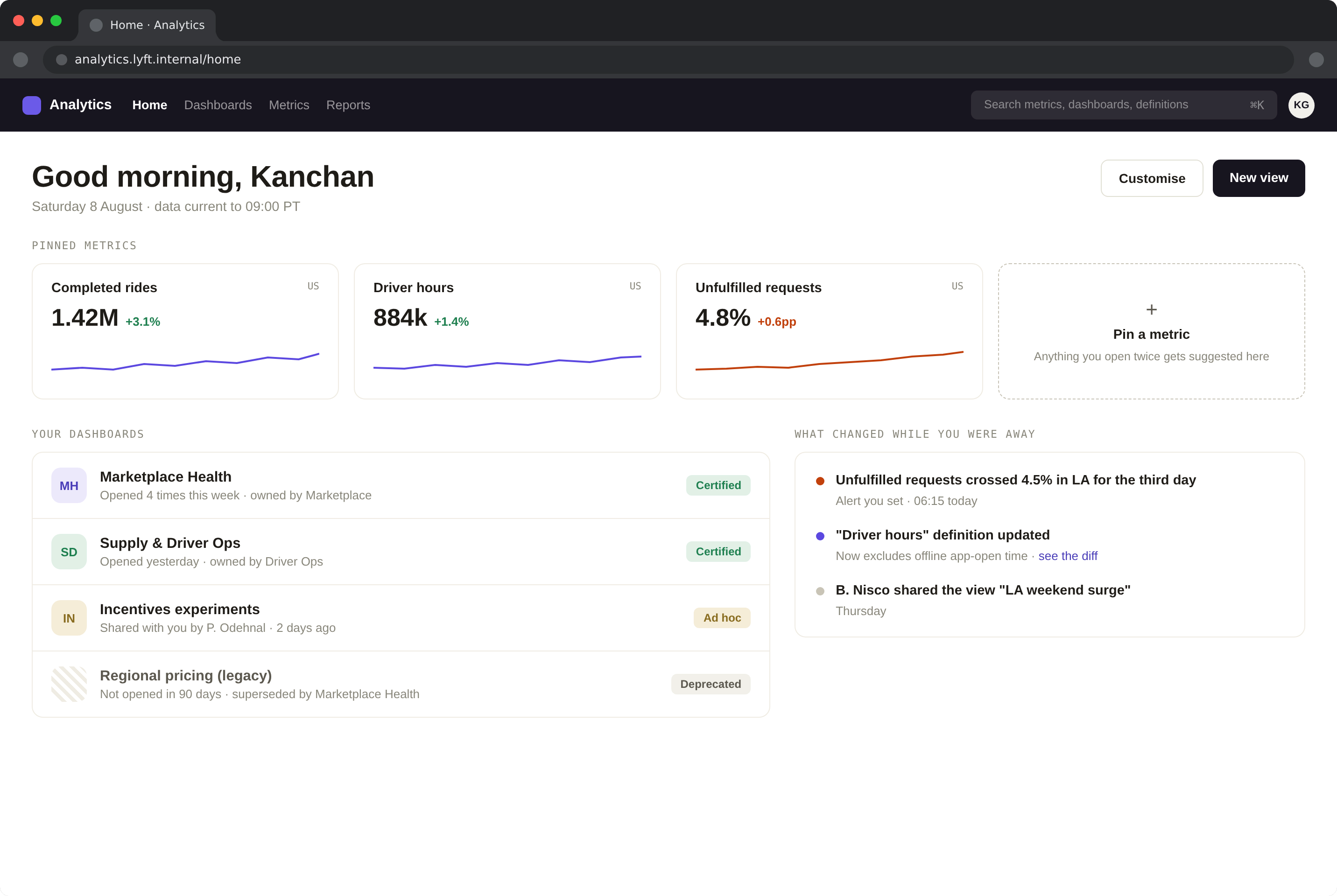
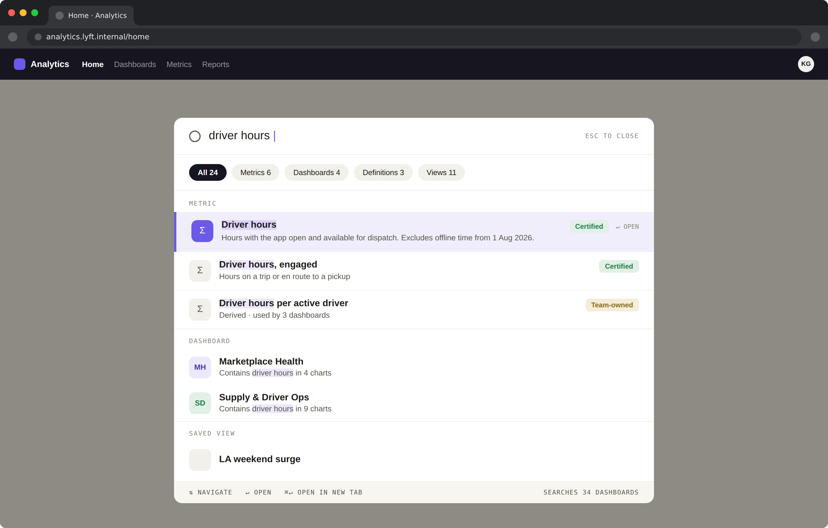
I explored four homepage concepts, a guided hub, a unified homepage with highlights from every product, an onboarding questionnaire that generates a personalised landing, and a build-your-own dashboard for power users. Alongside: one robust search across dashboards, pages, chart titles and metrics with categories as tags; cross-links between products so Executive Dashboard flows into Explore and Explore into Source of Truth; onboarding, training documents and videos; and a custom mark the team iterated on together (not shown), less branding than a badge of the tool’s evolution.
Outcome
What we solved, in one breath: real-time views for quick scanning with clear paths to deep-dives; seamless navigation across a connected ecosystem; global search that finds metrics without exact names; guided onboarding, docs and videos in place of a training gap; and unified branding people learned to trust.