kanchangaur.com / Clutch Design System
LOS ANGELES

Clutch Design System

2025 / lyft / design system, developer experience

Clutch is the platform Lyft engineers use to operate their services. It is built by dozens of teams, each shipping their own workflow into the same shell, which is exactly the condition that breeds one-off buttons.

I designed the system underneath it. The audience is engineers building internal tools with no designer attached, so the constraint was blunt: the default had to be correct, because the default is what ships.

INTERACTIVE / TOKENS IN PLAY
bg
surface
line
text
muted
accent
staging
us-east-1
rides-dispatchv4.18.2healthy
payouts-ledgerv2.31.0deploying
identity-verifyv9.4.7healthy
// one component set, two themes, two densities: every value in here is a token, not a decision. Illustrative services and versions
##

Density was the real request

Engineers kept asking for “a tighter version” and shipping it themselves with custom CSS. Making density a first-class token, one attribute, three derived spacing values, removed most of that drift, because the sanctioned path was now faster than the workaround.

Dark mode came from the same insight. It was not a preference feature; it was on-call at 3am.
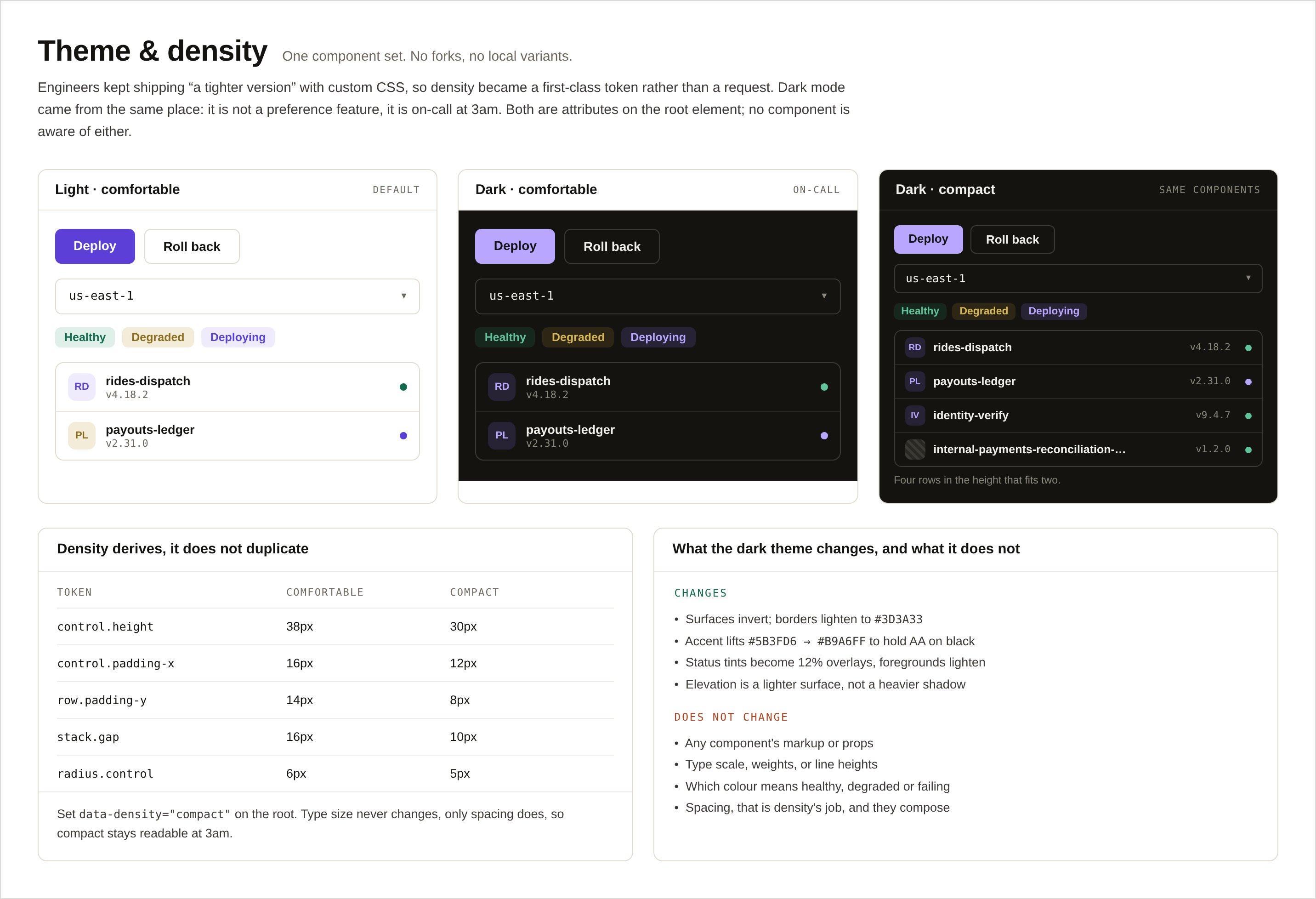
Theme and density, the same service card rendered in all four combinations of light and dark theme with comfortable and compact density, driven by two root attributes resolving through tokens, with no component reading either value
// fig.1: two attributes, four combinations, one component set: nothing reads the theme, everything reads tokens
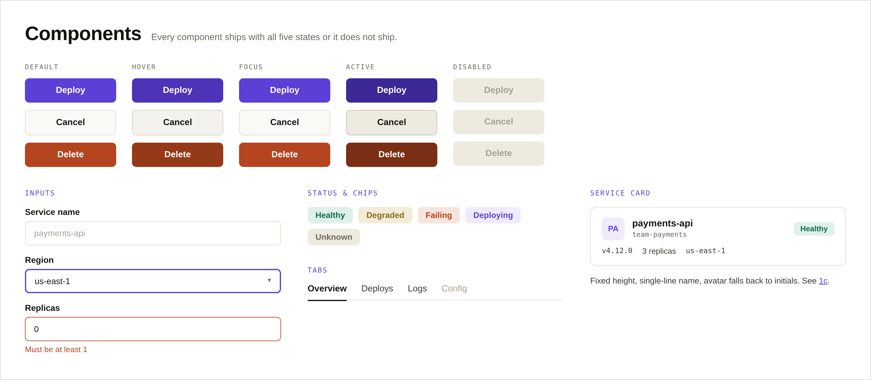
The component sheet, a state matrix of primary, secondary and destructive buttons across default, hover, focus, active and disabled, plus inputs, status chips, tabs and the service card
// fig.2: the component sheet: every control in all five states, or it does not ship
##

For engineers, the docs are the interface

A design system for people who do not open Figma lives or dies on its documentation. Every component page shows the tokens it consumes and the states it ships with, so “why does this look wrong” is a lookup, not a message to a designer. And there is a contribution path, a team that needs a new pattern can propose it inside the system instead of forking outside it, which is the difference between a design system and a style guide.

The bet underneath all of it: consistency is a by-product of convenience. Engineers did not adopt the system because they were told to; they adopted it because the sanctioned path was genuinely the fastest way to ship an internal tool that looks intentional.
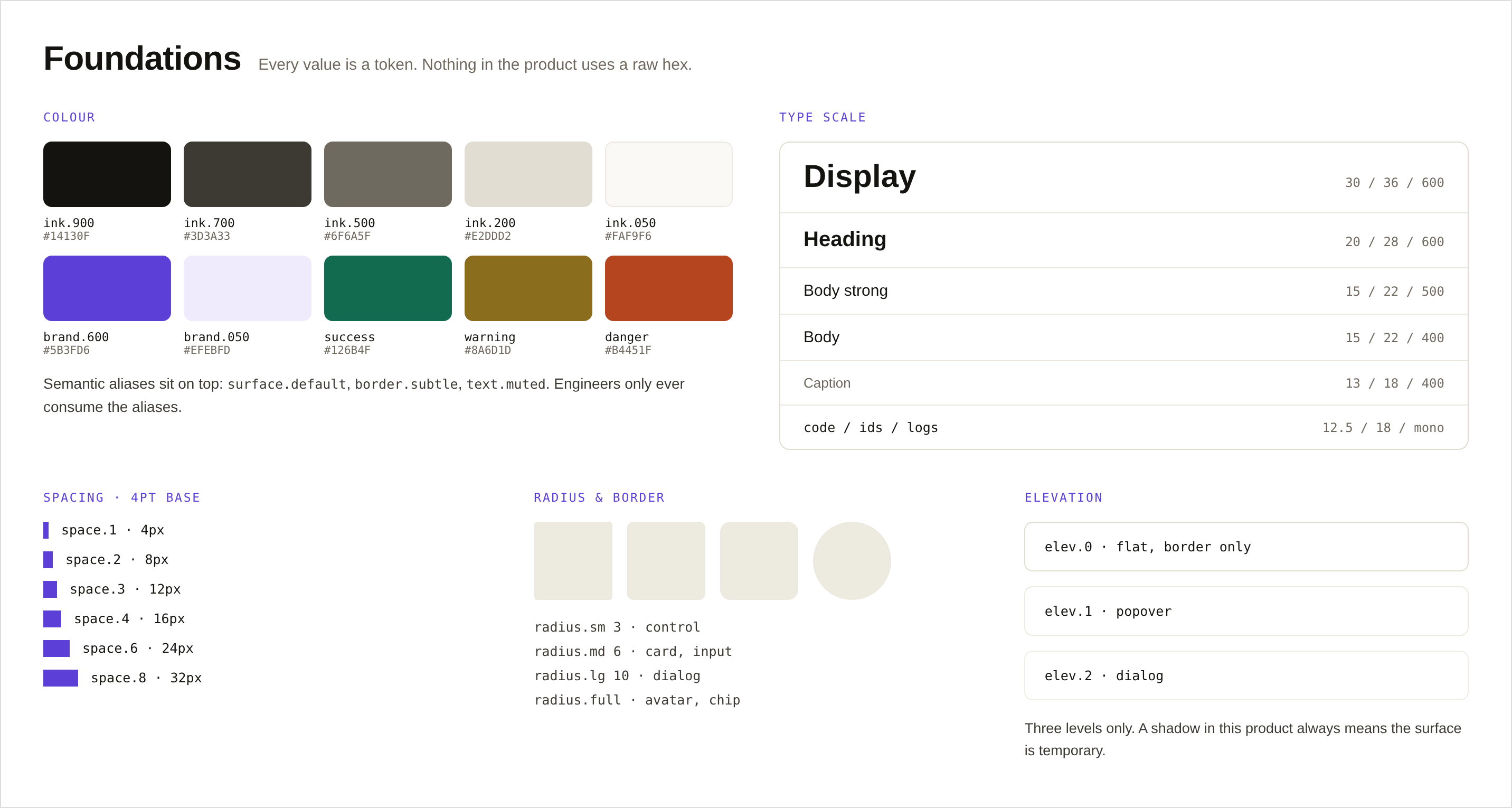
Foundations, colour ramps with token names, the type scale, spacing bars, radii and elevation, with primitives named by value and aliases by role
// fig.3: foundations: primitives named by value, aliases by role: only aliases reach code
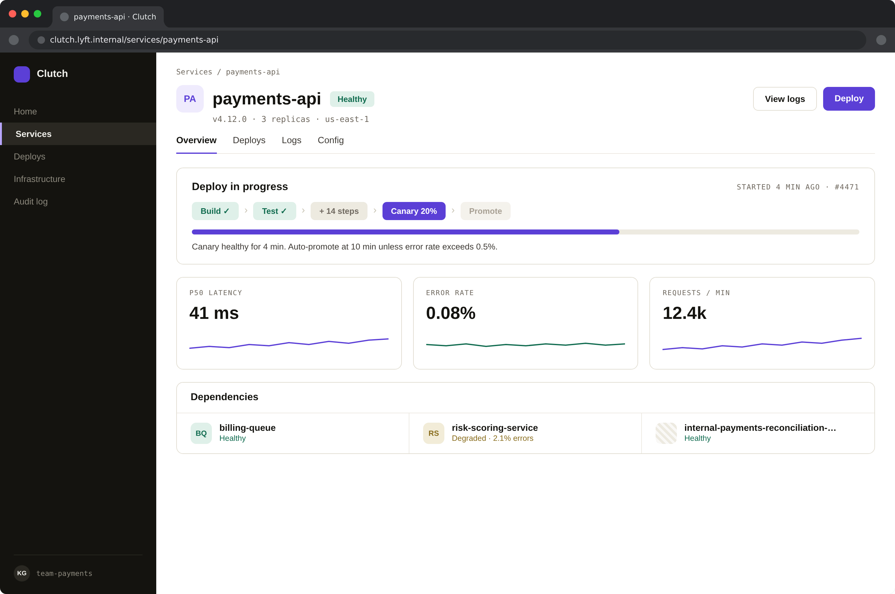
The system applied, a service detail screen with a collapsed deploy pipeline, canary progress, metric sparklines and a dependencies row
// fig.4a: the system on a real screen
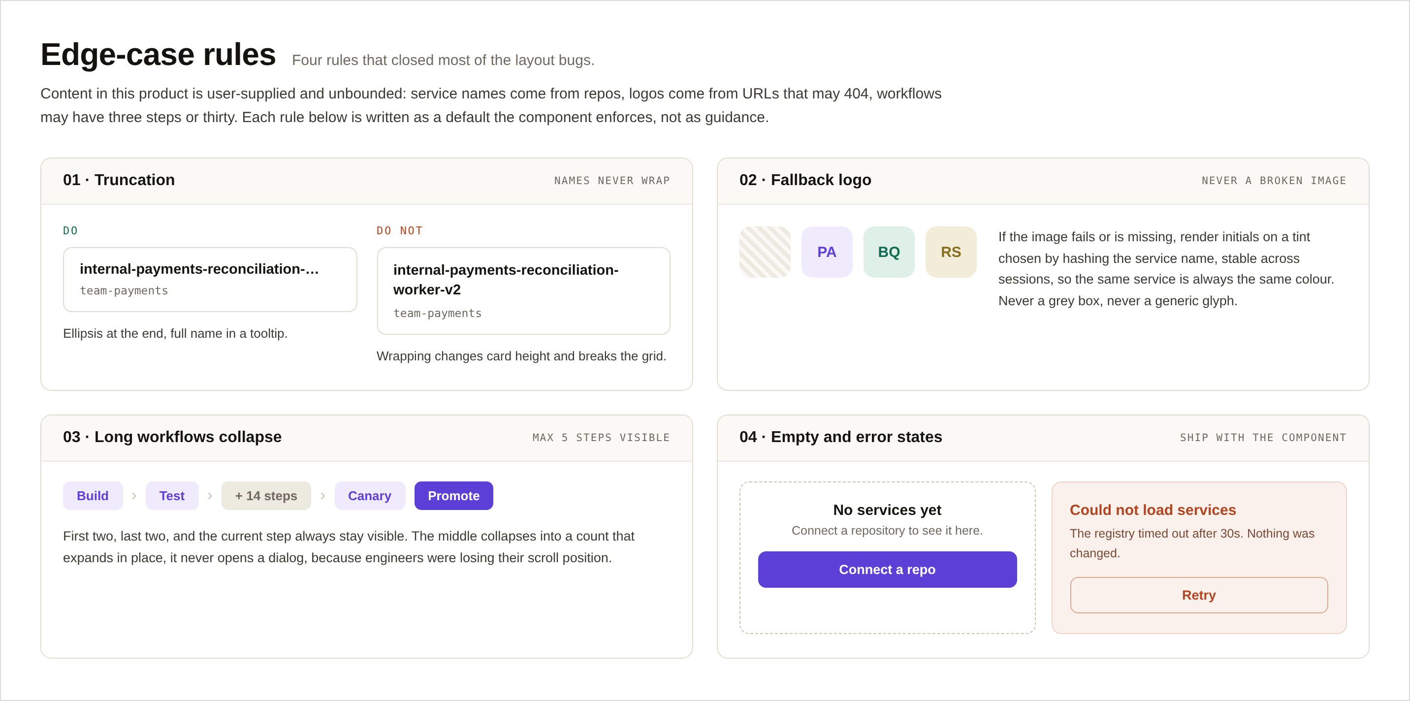
Edge-case rules as component defaults, truncation with tooltip, hashed-initials logo fallback, long workflows collapsing in place, and error copy that states whether anything changed
// fig.4b: the edge-case rules that ship as defaults
##

Outcome

1
Component set underneath every team’s workflow, no forks, no local variants.
3am
Dark mode designed for on-call, not for preference.
2
Themes and two densities from one token set, no forked components.