LA Metro Safety Hub
Metro needed one place to explain what it was doing about safety on the system, and to let riders report an incident without hunting for a phone number.
The hard part was tone. Safety pages fail in two directions: so reassuring they read as public relations, or so detailed they read as a warning. Riders in testing were sharp about both.
Report first, read second
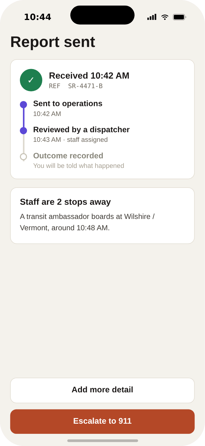
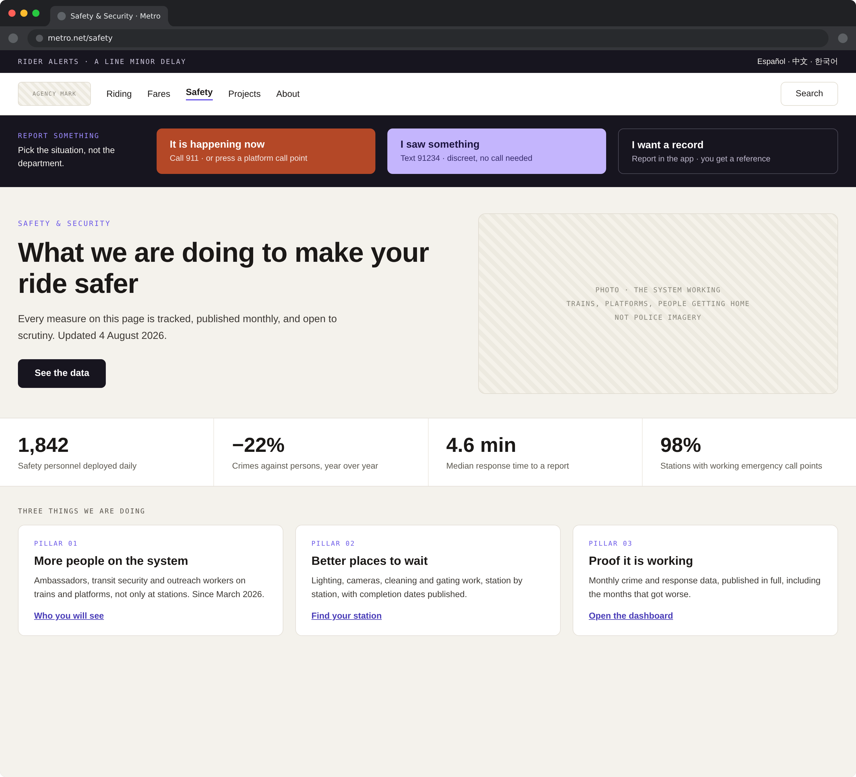
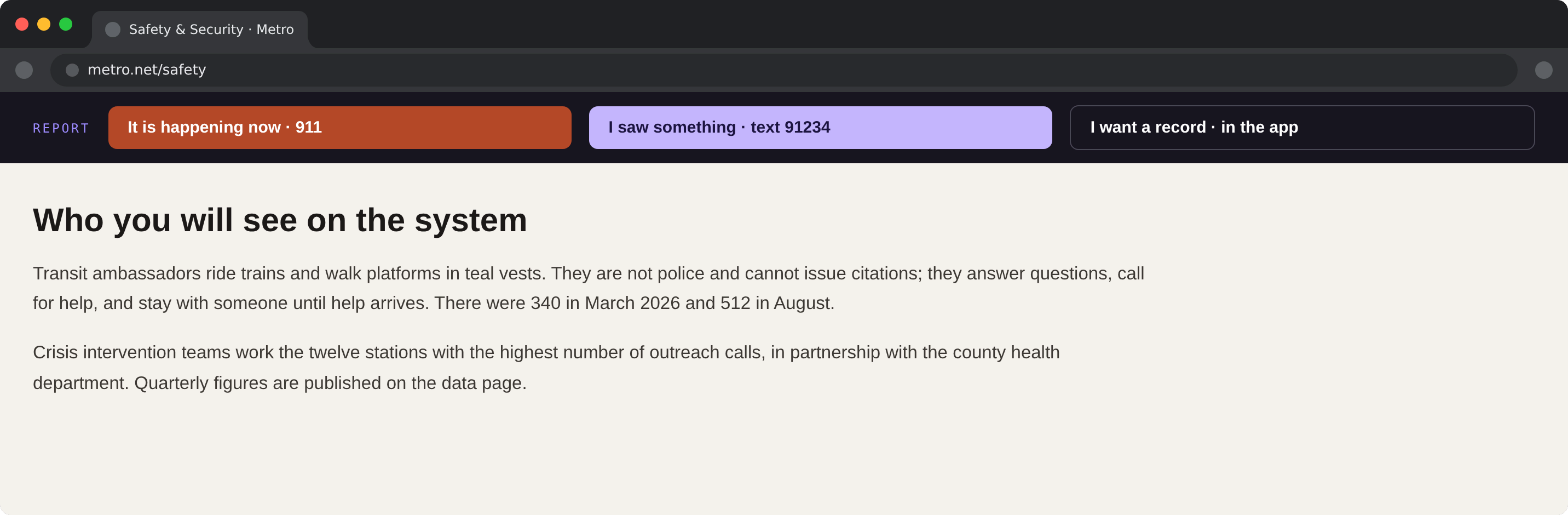
Much of the traffic we anticipated was someone with a problem right now. So reporting is the first thing on the page and it never leaves the viewport, a persistent bar with the transit watch line, the text-a-tip number, and 911, in that order, with an explanation of which to use when.
Everything else, the ambassador programme, the crisis intervention teams, the quarterly numbers, sits below it, written in plain sentences with the dates left in. Undated reassurance is not reassurance.
Writing for someone having a bad day
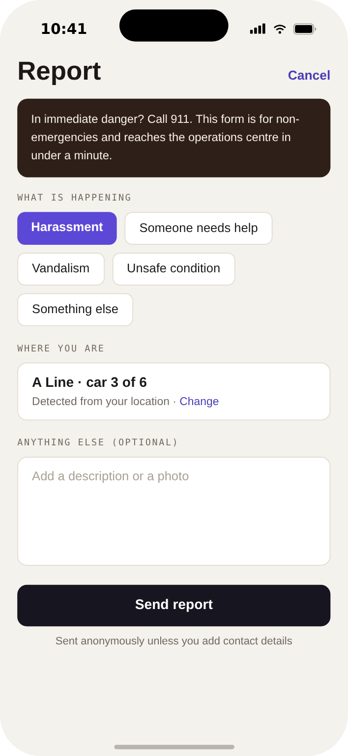
Some of the people opening this page have just experienced something. The design treats that as a requirement, not an edge case: short sentences, no siren-red visual language, nothing blinking, and the reporting options organised by situation rather than by department: it is happening now, I saw something, I want a record, because nobody in distress should have to know which agency owns which phone number.
The same restraint applies to imagery. A safety page decorated with police photography reassures one rider and warns off another; the hub leads with the system working, trains, platforms, people getting home, and lets the text carry the seriousness.
Publishing the numbers
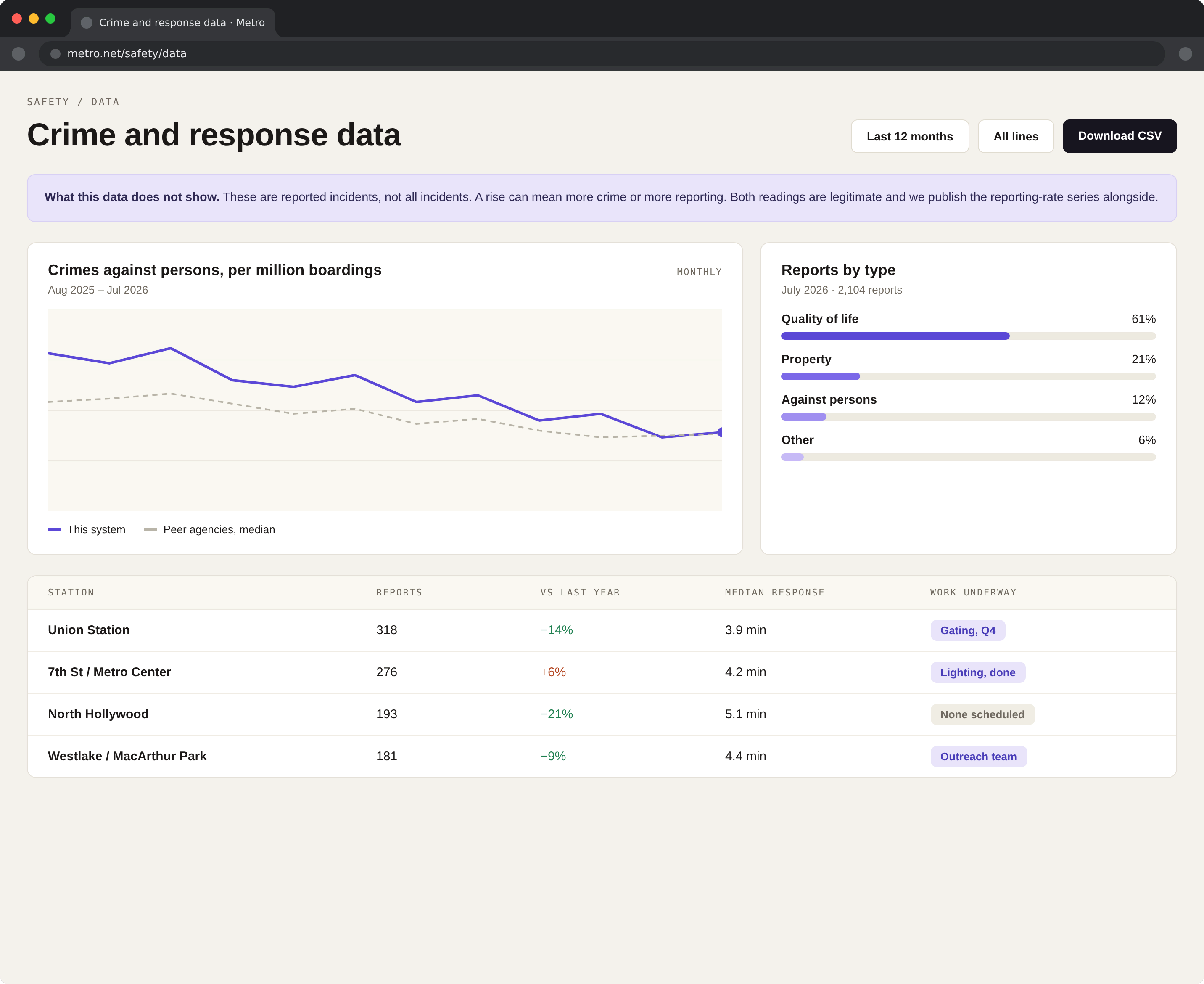
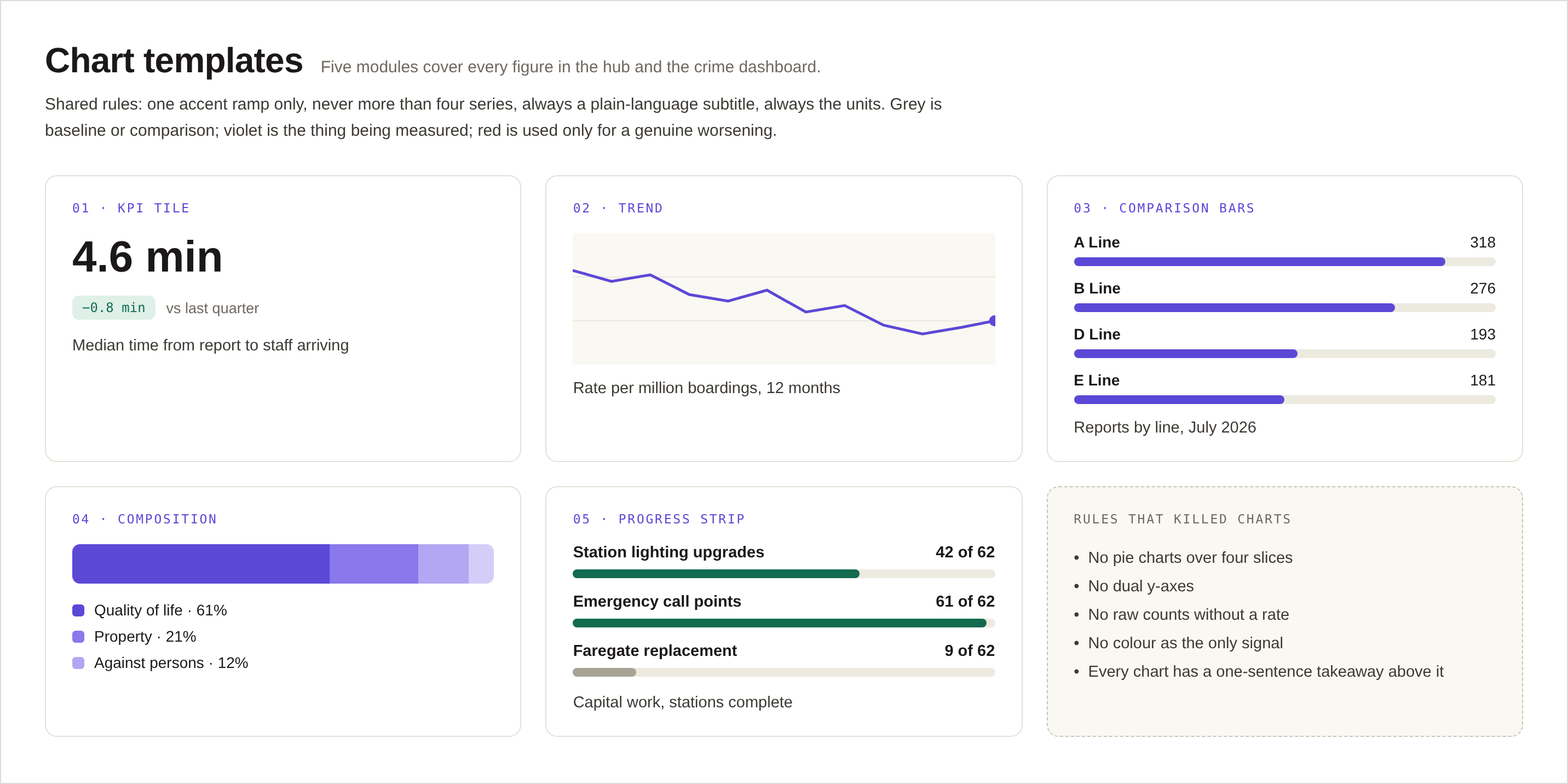
Metro publishes crime statistics; almost nobody could read them. I designed a small set of charts with fixed rules: absolute counts alongside rate per boarding, twelve months minimum so seasonality is visible, and no truncated y-axes. When an agency publishes numbers about itself, the chart conventions are an ethics question before they are a design one.